Studio - Reducing time to create Apps by 75%
Problem
Despite the launch of low code studio, it took teams to 5 months to deploy an app
There was no significant reduction (6%) in number of requests from the clients
The clients were highly dependent on development and product teams sprint cycles to configure and create applications.
Impact
Time to create apps came down by 75%
Number of tickets went down by 67%
With the self-serve low-code studio clients could make and preview the changes real time with no dependency on development teams
Company
GEP is a supply chain and procurement company with over 550 clients. Its product suite includes more than 20 applications. The company wanted to empower its clients and partners to make real-time updates to their applications using a self-serve platform - Quantum Studio.
Role
Lead Designer
Project timeline
2022-2024
Understanding the problem
Why are we doing this?
1. Application creation time
Depending on the size of the tasks, updating applications could take 2 weeks to a few months
2. Dependency on engineering team
To make any change the clients and partners are heavily dependent on GEP customer management and development team. A self-serve platform would help reduce the dependency and gain engineering bandwidth
3. Seamless process, High flexibility
With standard out of the box templates for all apps, users could customise or create their own apps seamlessly and quickly. The templates helped bring in consistency across all apps a client used along with providing flexibility to customise
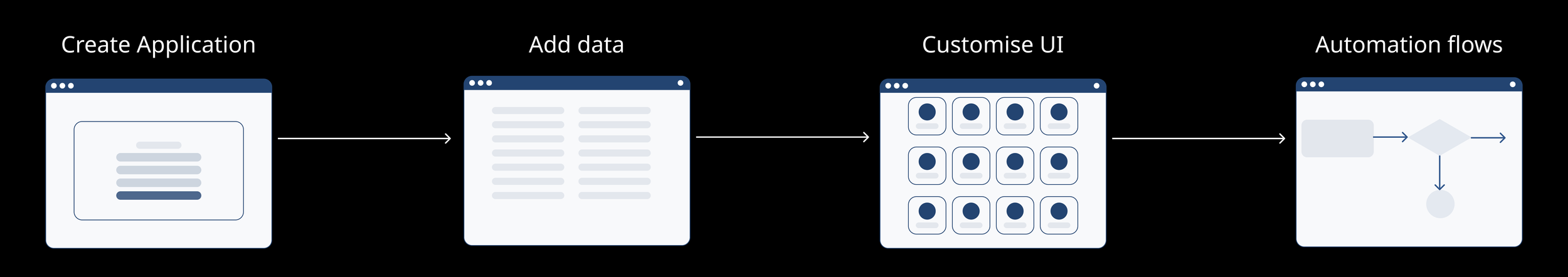
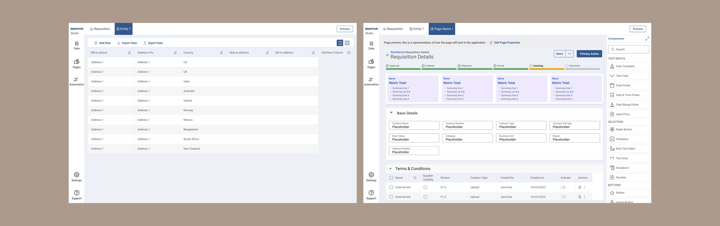
Flow to create an app
Typically the users followed the standard recommended flow to create an app.
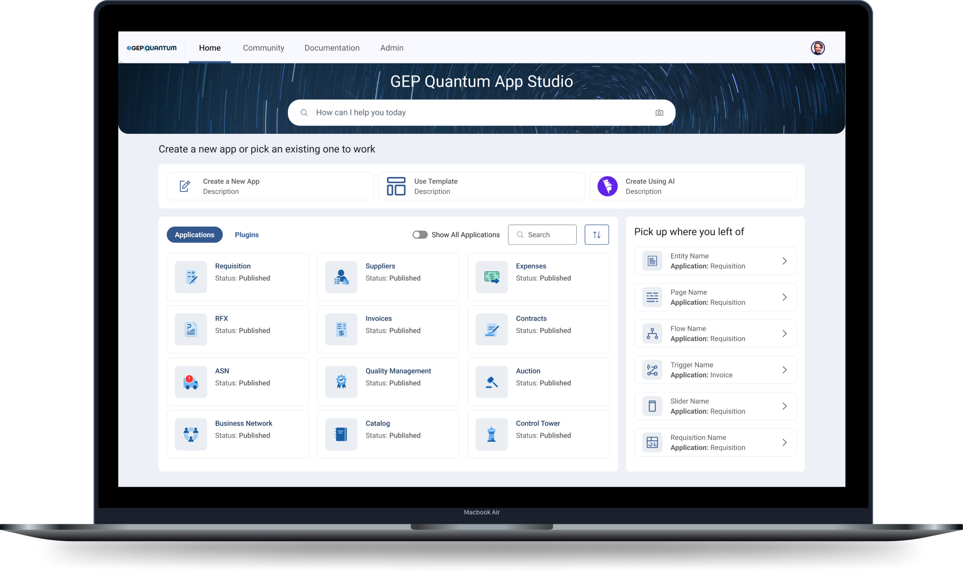
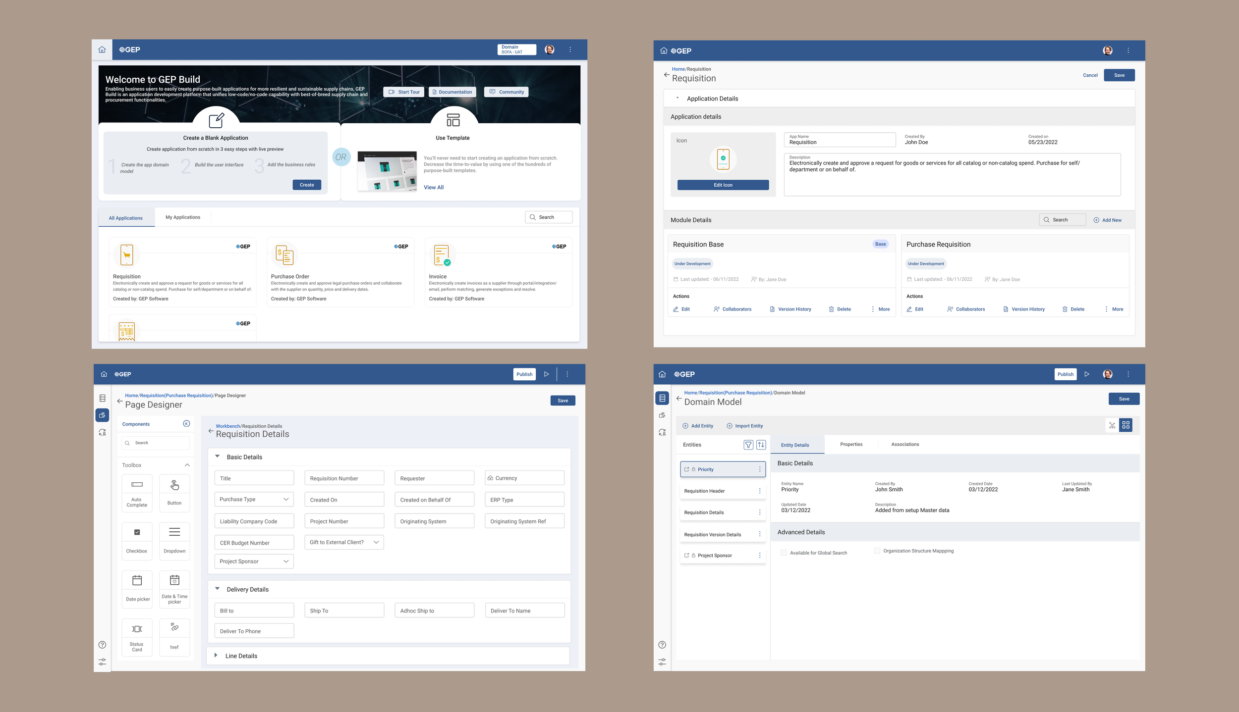
Existing Experience
For the standard app creation flow, we conducted task based usability testing with internal users. The internal users included - application developers and customer support team representatives. These sessions were all conducted remotely and lasted 1-1.5 hours.
Usability testing feedback
Based on the testing results, we found key areas of concerns. The design was confusing and users got lost, especially the first time users. We found general trends across most screens.
1. Too many clicks for returning user
At any given time, users would be working on a single or at-most two apps. Between different sessions, they wanted to pick up where they left off. Based on what they were doing, it could be 5-6 clicks after login
2. No in-context documentation
First time users, needed help understanding different features. While they understood this is complex tool, they needed guidance. The returning users also felt, they would need some in-context documentation
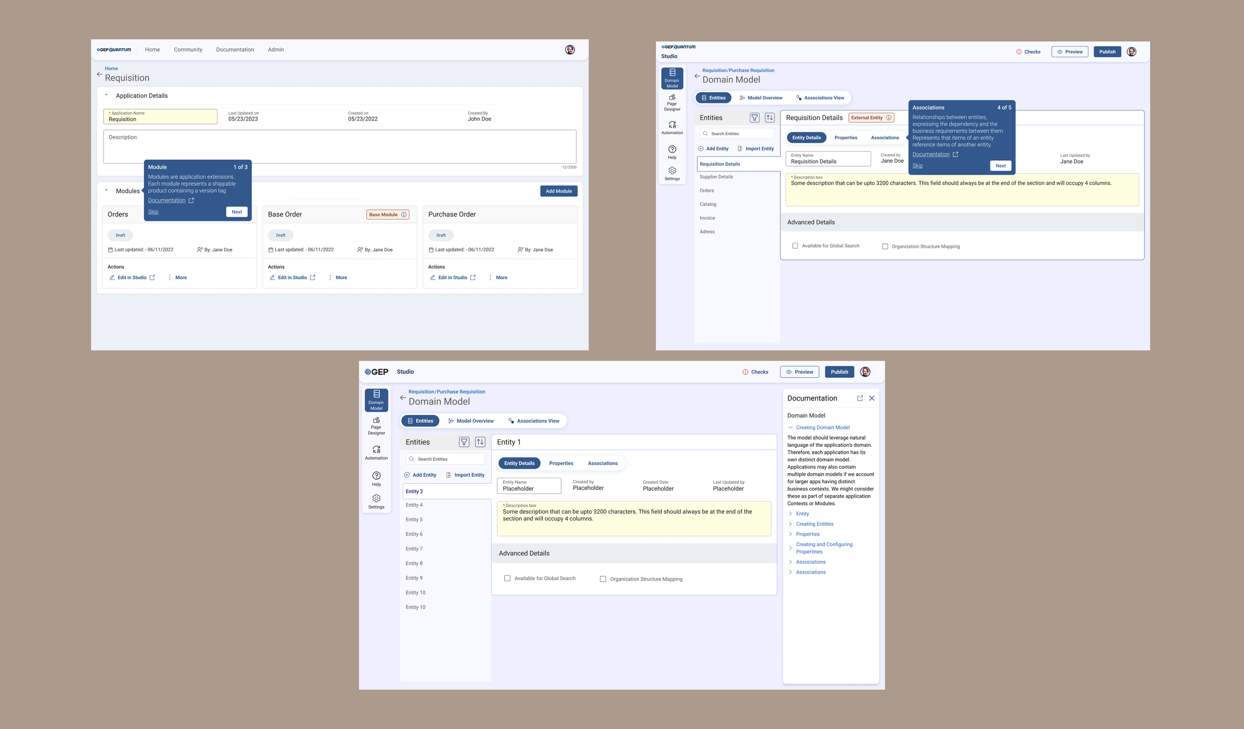
3. Icons with no context
The users felt the icons were not intuitive. They thought text with icons would be more user-friendly. The especially got confused with the icons in left navigation and header
4. Confusing jargon
In a lot of areas, GEP specific jargon was used. These were legacy terms in the technical architecture and were now a part of the Studio UI. Users (application developers) who were trained understood these terms, customer support team members got confused with these terms
Redesign - Iteration 1
Persona based journey
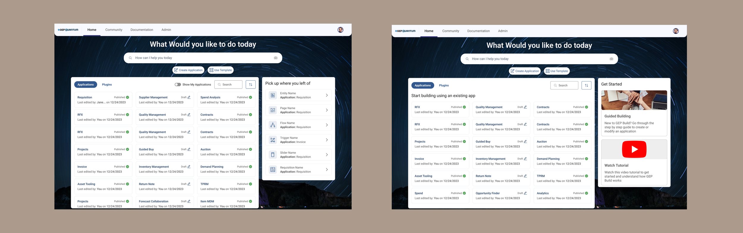
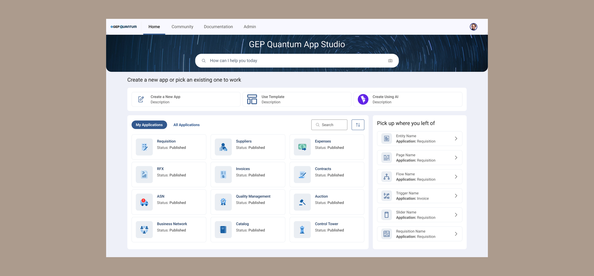
We changed the home screen to give more contextual information. Based on the whether the user was a new user or a returning user, they would see different widgets.
1. Returning users would see a widget “pick up where you left off” which would allow them to jump into specific parts of the app with a single click
2. New users would be shown options to pick “guided building” or watch tutorials
Tooltips and in-context documentation
1. To guide users we introduced the concept of tooltips, which they could turn and off using the help option in the left navigation
2. We also added in-context documentation, which users could access anytime while working on a particular screen
Iconography and navigation
1. Wherever, we had only icons, we added text. This led to significant changes to the left navigation and header
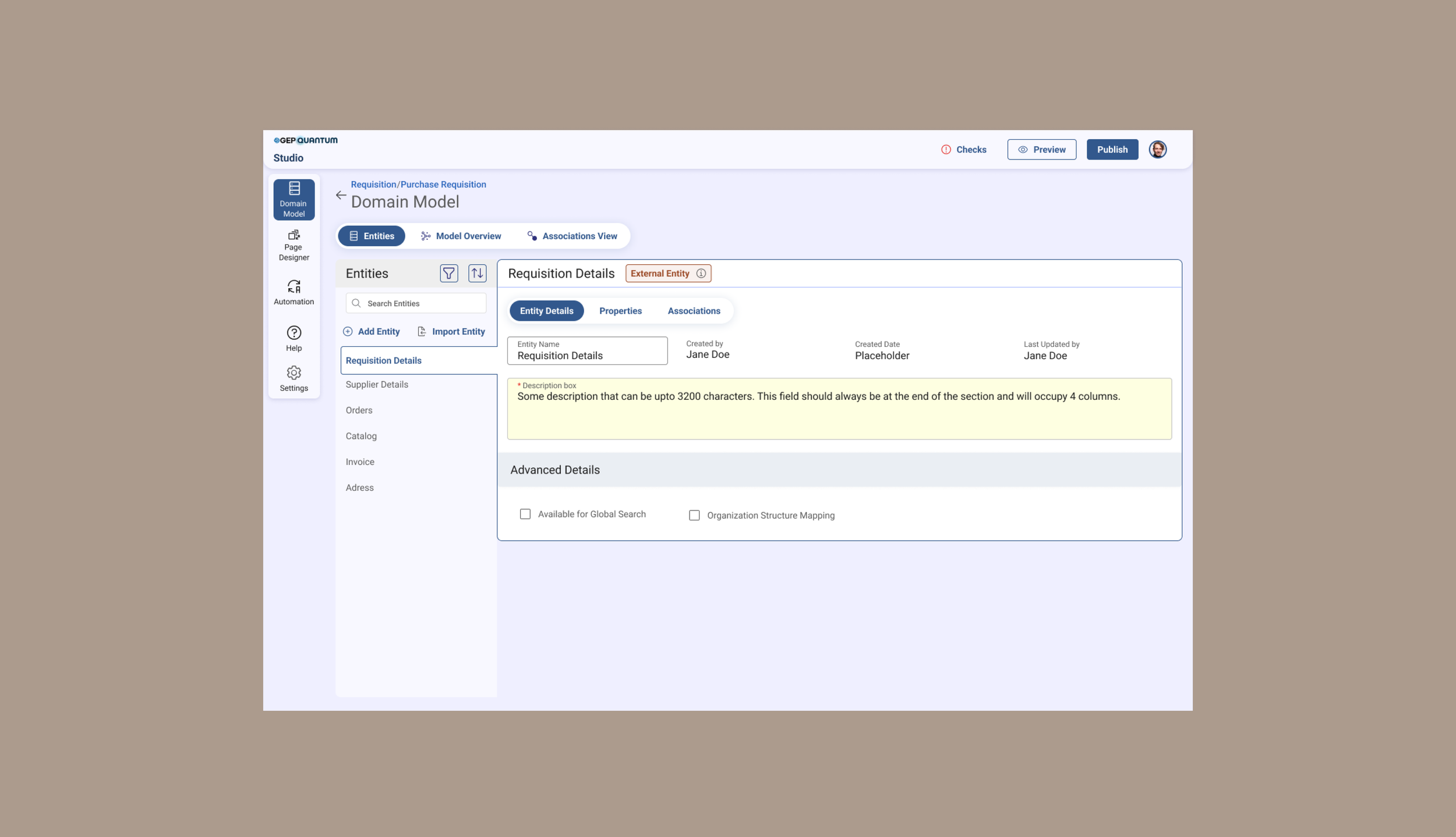
2. In some cases (like external entity in below screenshot) we completely removed icons and added chips and information tooltip to give more context
Validating Iteration 1
1. All 6 of the returning users like the “pick-up where you left” of widget
After our redesigns, we conducted another round of usability testing to validate our designs
2. While most users liked the tooltips and in-context documentation, they still got confused and said, the might not end up reading all the information
3. The visual changes in navigation made it more intuitive, both returning and new user appreciated it
Removing jargon from application details
1. To keep it simple, we removed jargon that could confuse users. Since those features were still needed, we worked with backend development teams to make sure they were created under the hood and could still be accessed in advanced settings
Redesigning - Iteration 2
Based on the feedback received, we tried to further simplify our designs.
Reducing cognitive load on home screen
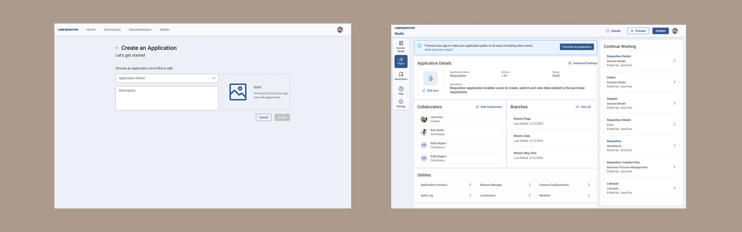
1. Significant visual changes were made to de-clutter this screen. Because of the number of apps a user could see, this screen was information heavy. Instead of using a full image background, we replaced it with a banner to highlight search at top.
3. Application card design was simplified to show only application name and status
2. The create app options, where added in widget area for more visibility
More working space
1. In the working screens for data and UI designer, modified navigation to increase the working area
2. Introduced tabs in header, so users could jump between different modules they were working on; this reduced navigation time clicks
The impact
Positive results
Number of tickets went down by 80%
With the changes we made, we were able to significantly reduce the time for creating and deploying applications by 75%
Users were able to make real-time changes to their application without the intervention from the engineering team
We introduced usability changes to reduce clicks from 5-6 to 1-2, which improved the usability
What’s next
Now that we have the tool launched to the partners, we are gathering feedback from them and working on more specific features of the tool.