Mobile App's Requisition Creation: 12% Adoption Rate
Overview
Problem
The existing GEP mobile app was not persona specific and was dated. It was missing feature and visual parity with web experience.
The app also didn’t have the feature to create a requisition. Users who were on the go, had to wait to get to their desktops to create requisition. This feature was paricularly important for clients using the app.
Outcome
Sales enablement - 4 new clients added. We launched a completely working version of the app on the app store for the sales team to pitch to new clients
Post launch overall time taken to approve requisitions went down by 19%
Number of requisitions created on mobile increased by 12% in 2 months
Role
Lead Designer
Team
Product Manager, Development Lead, User Researcher
Responsibilities
UX Design | Information Architecture | Visual Design | Interaction Design | Stakeholder alignment | Presentation
Objective
Develop a mobile app to …
Work on the go
With the growing needs in procurement and supply chain, there is a need for all user personas including managers to have access to information to take decisions instantly
Provide flexibility
Users want to create, edit, view, approve documents on the go, giving them flexibility to work on the go. Mobile apps are rapidly being used in the industry to enable users to do this
Reduce time
Using desktop to submit, approve and track purchases results in longer processing times. Mobile apps help users to create, view, and process requests in real time
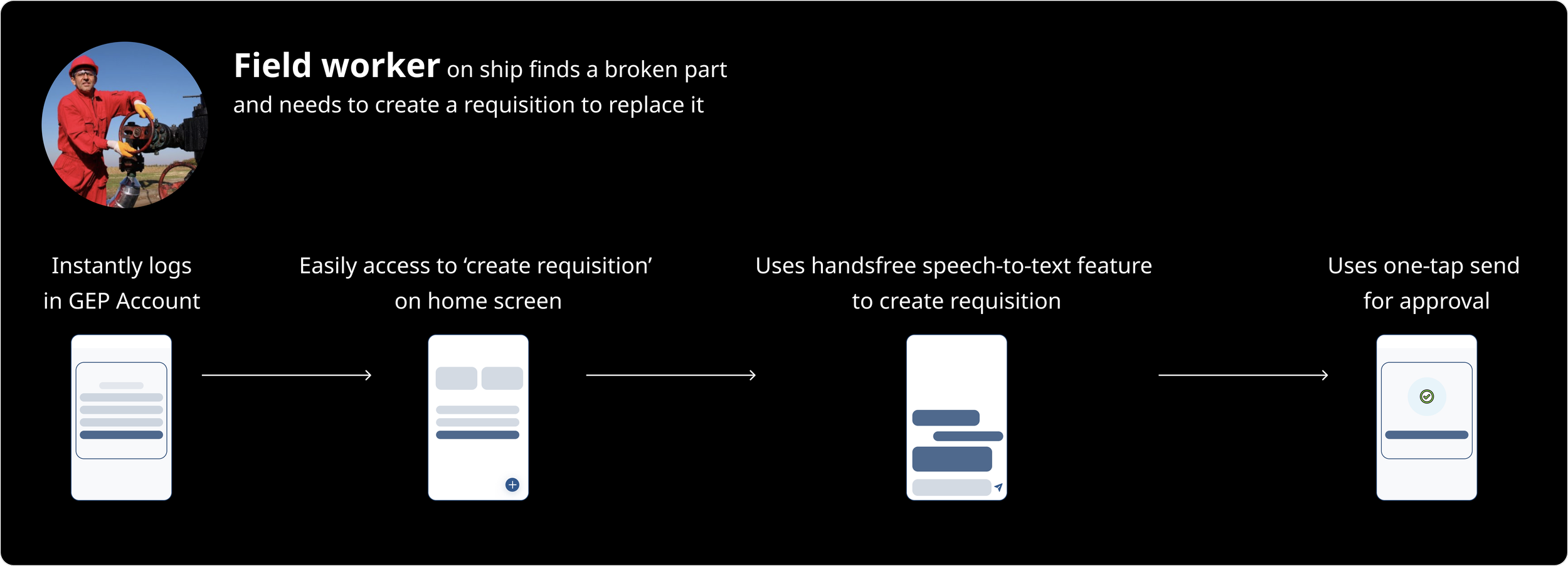
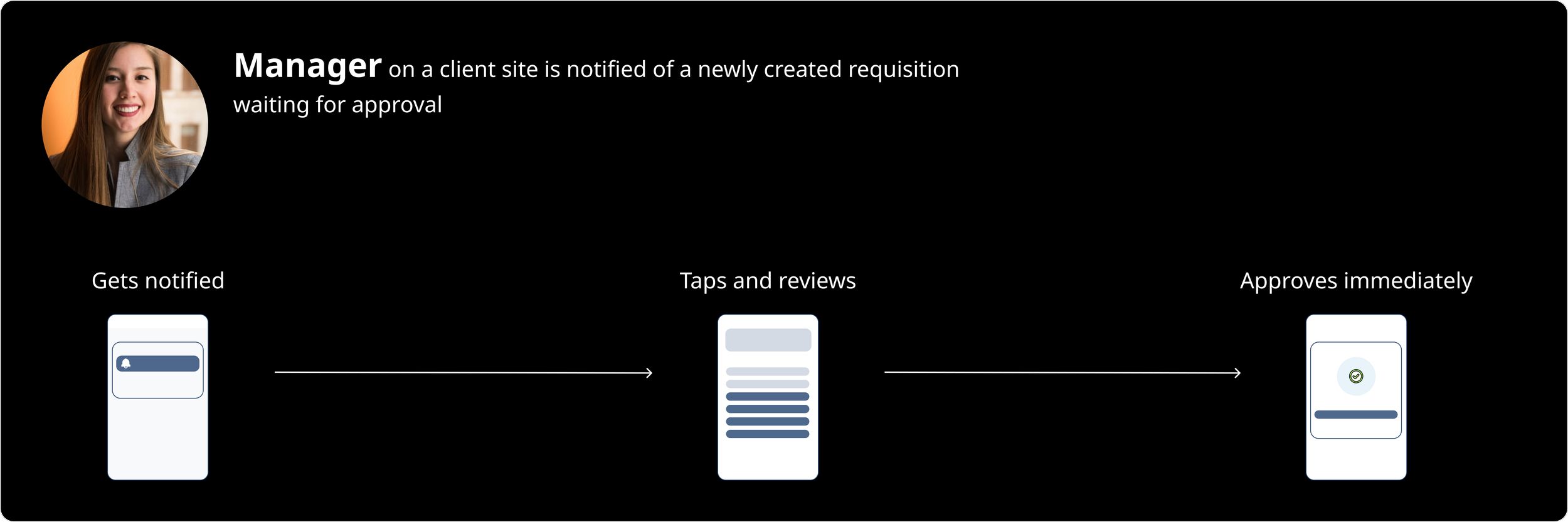
User journeys
Based on client needs and current usage we mapped the primary personas which helped us identify what the flow could be for all users.
Existing Designs
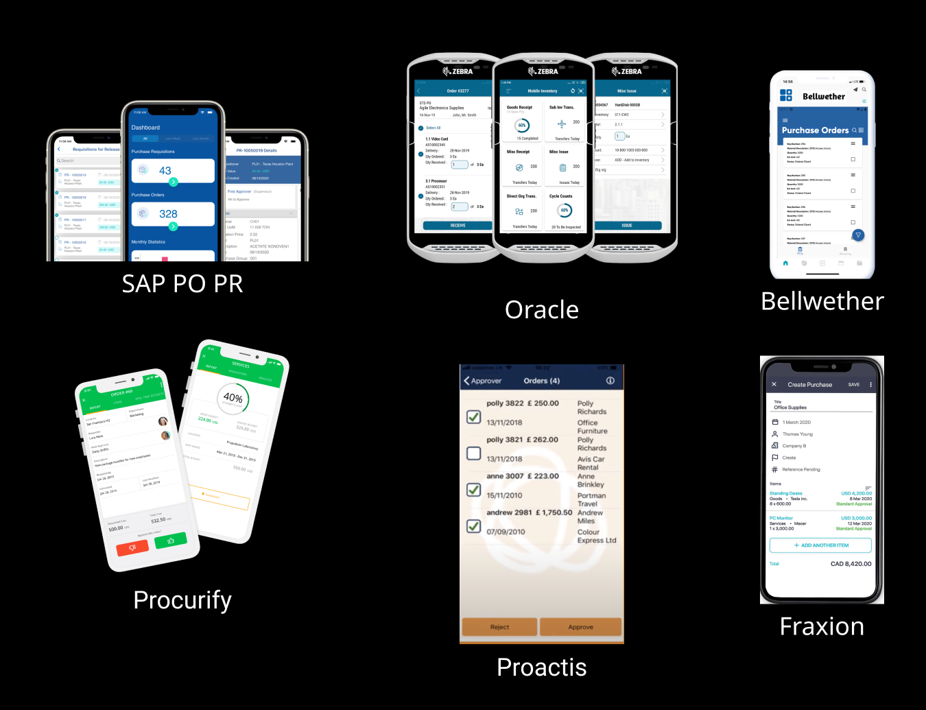
Competitive Analysis
We looked at some of our direct competitors and analyzed their apps to understand the landscape in this space. We found a few key features that were present in these apps were missing from our app.
1. A lot of apps were prioritizing showing pending actions/tasks on the home screen
2. Some apps were giving option to approve/reject documents upfront, users didn’t have to go inside the document details to take important actions
3. They were allowing bulk actions on landing screen
4. Most apps were sending alerts and notifications for actions that needed immediate attention
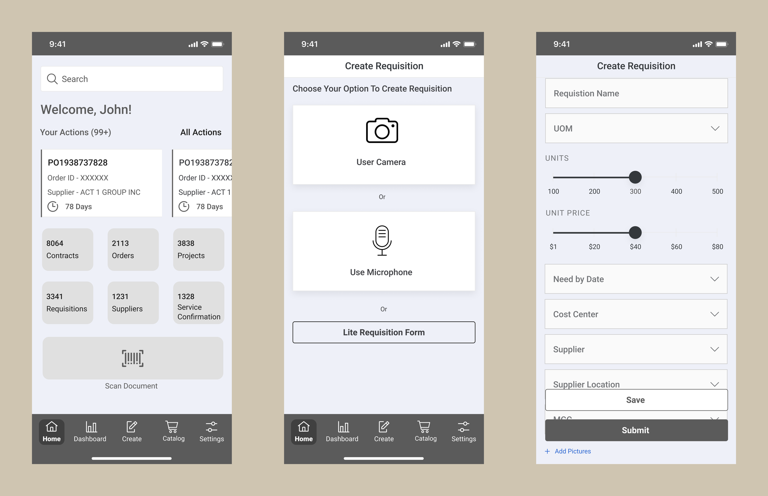
Wireframing
Based on our findings from client feedback and competitive analysis, we started creating wireframes. The idea was to come up with a basic Information Architecture and test the low fidelity designs.
Testing wireframes
Navigation
The team highlighted issues with the bottom navigation.
Settings was not going to be used frequently
Not all users would have the access right to view dashboard and create
Create needed more focus
Actions
Adding actions on home screen was an important feature and good addition but they wanted users to be able to take action without having to go in details screens
Creation flow
Overall they liked the three options to create requisition but recommended we could leverage GEP AI capabilities to make the process smoother and quicker.
We gathered initial feedback on the low fidelity in a focus group that comprised of internal solution design team. This specific team was responsible to work with clients and understand their mobile needs.
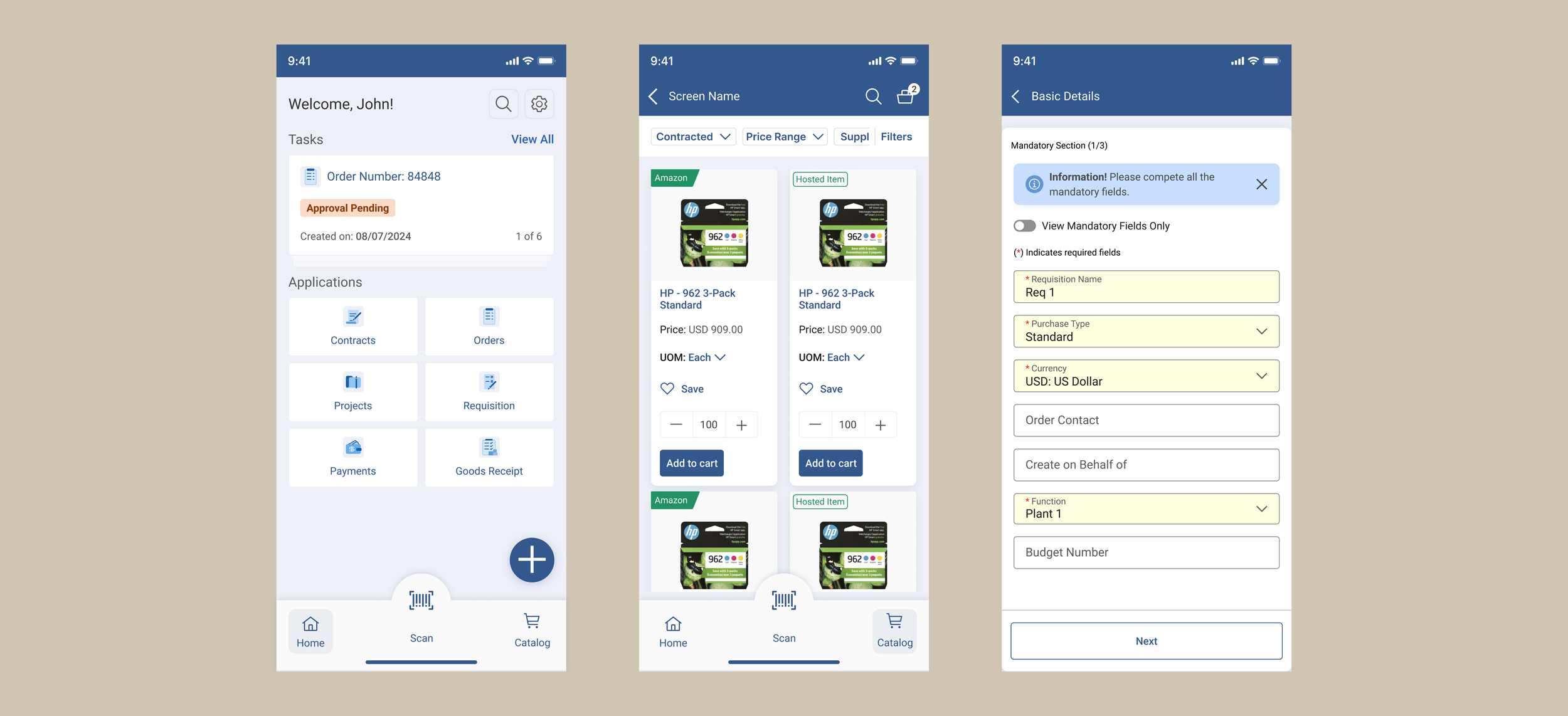
Visual Design
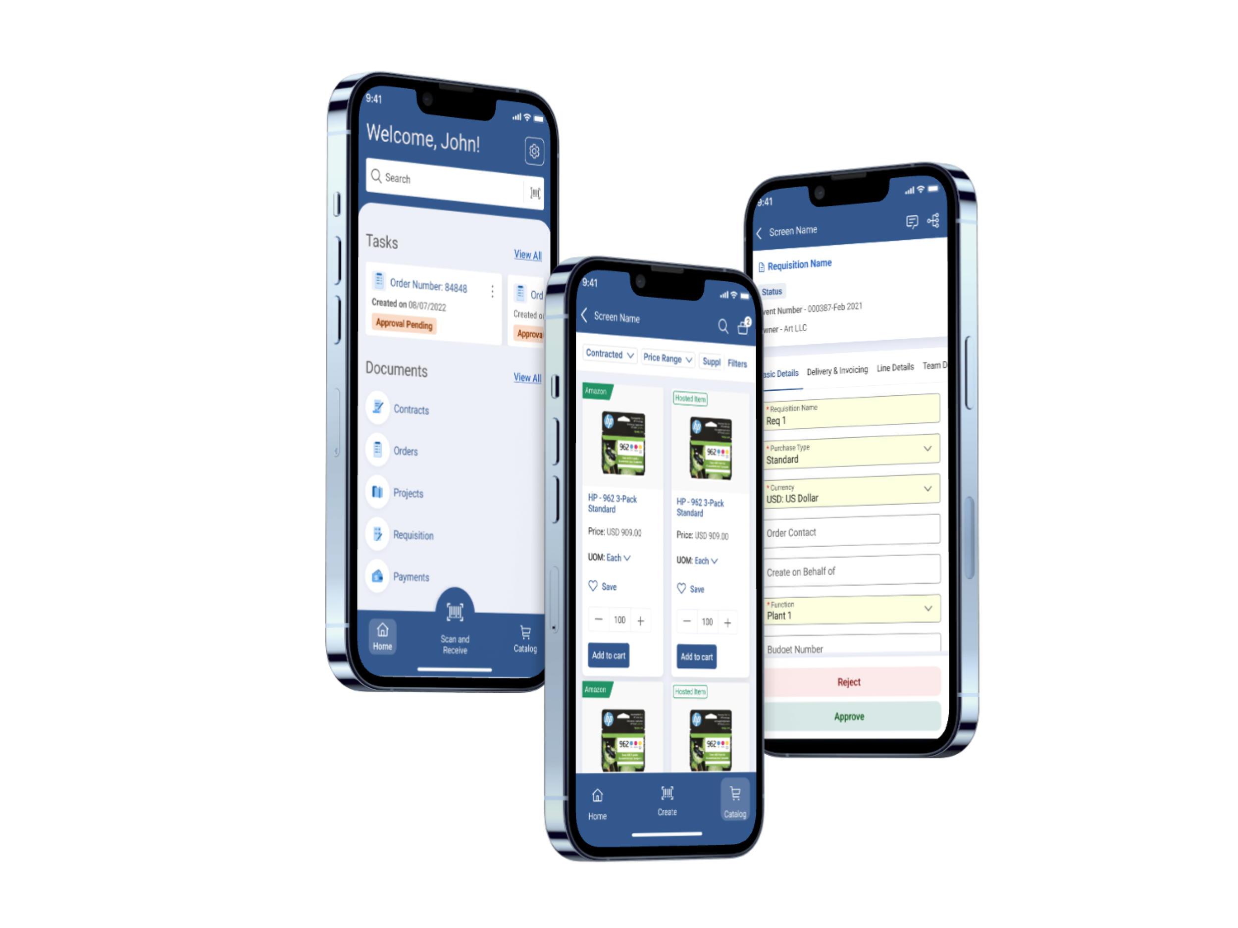
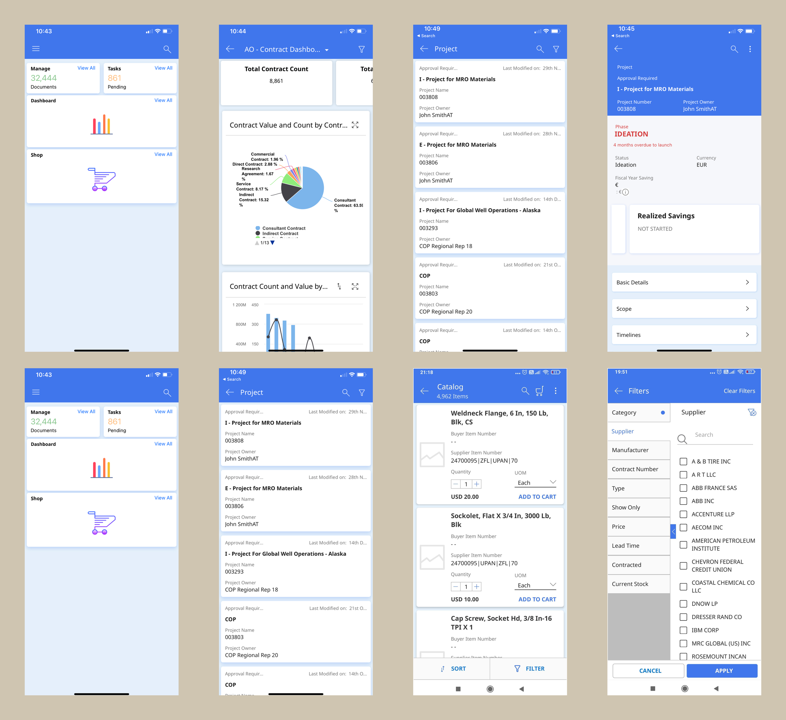
Key Screens
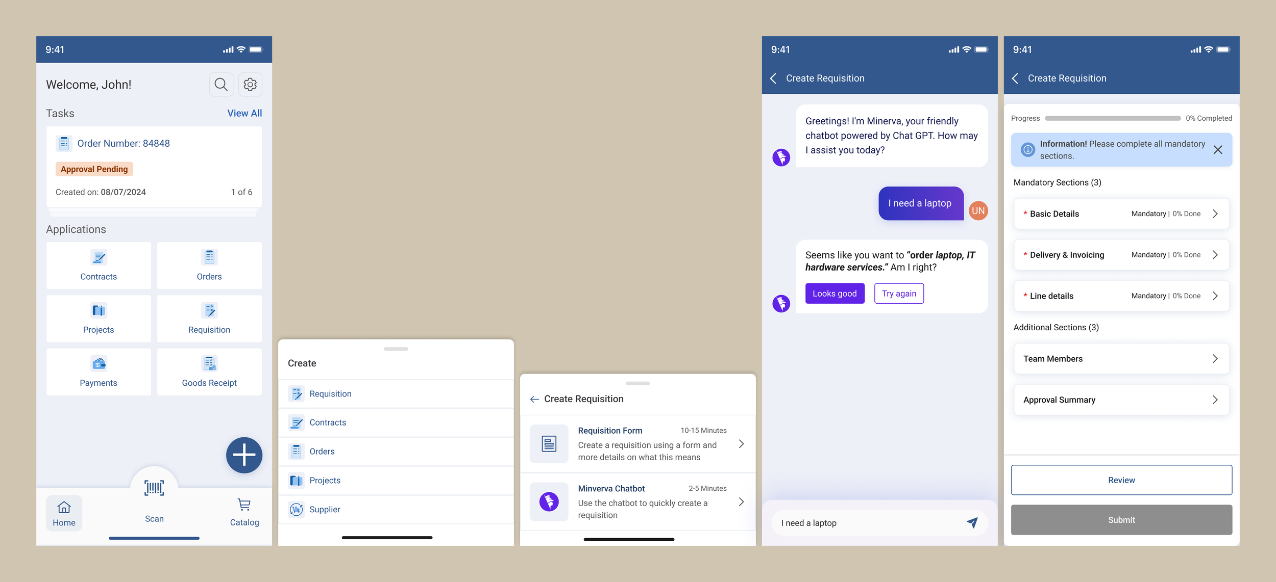
Create Requisition Screens
The Impact
Measuring the results
Now that we have successfully launched the app on the iOS appstore and migrated existing clients to it, we evaluated how the users interact with the app using analytics. Here were some findings
Post launch overall time taken to approve requisitions went down by 19%
Number of requisitions created on mobile increased by 12% in 2 months
We were also able to create more business opportunities for the sales team. They pitched to new clients and were able to add new clients.